Designing a Logo for Bungees
How I turned a playful brief into Bungees' brand identity.
An identity built from 6 key ingredients
The goal was to create a sweet, friendly and memorable identity for Bungees, guided by:
- Cute and Playful
- Bite-Mark Detail
- Flower Motif
- Pink Palette
- Burgundy Palette
- The Bungees Name
Building a memorable brand identity
Inspired by the brand’s pink and burgundy palette, each element brings together warmth, playfulness and a love for baking..
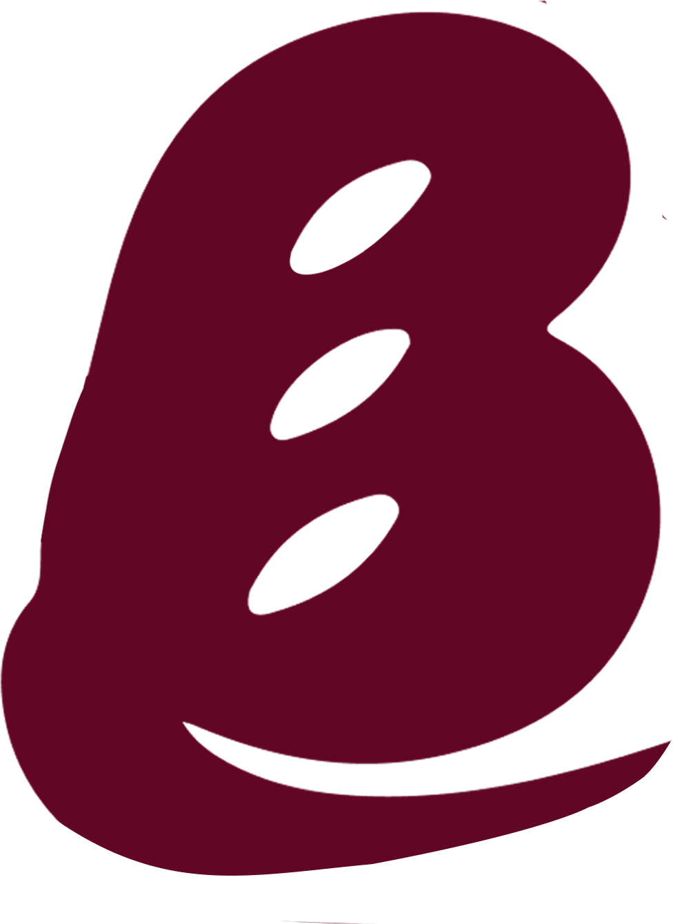
The Baguette “B”
The letter B is shaped like a baguette, creating a distinctive wordmark with a bakery touch.
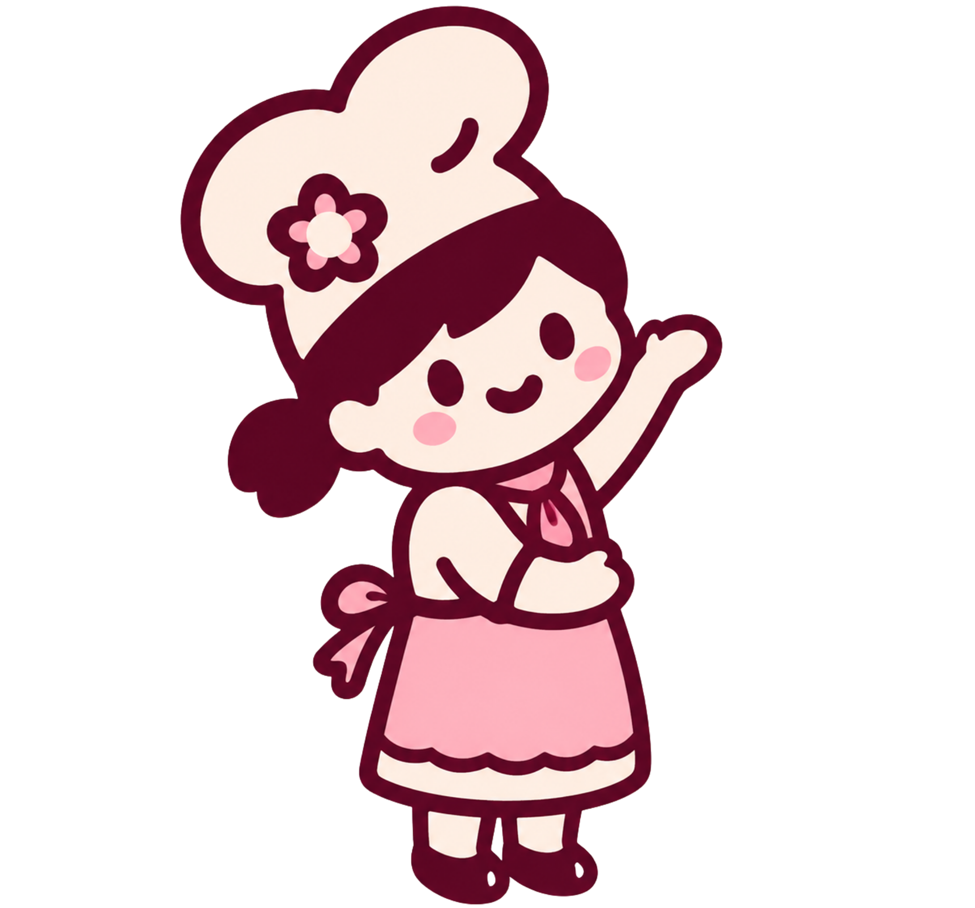
The Baker Mascot
A cheerful baker with a flower adds warmth, personality and a charming handmade feel.
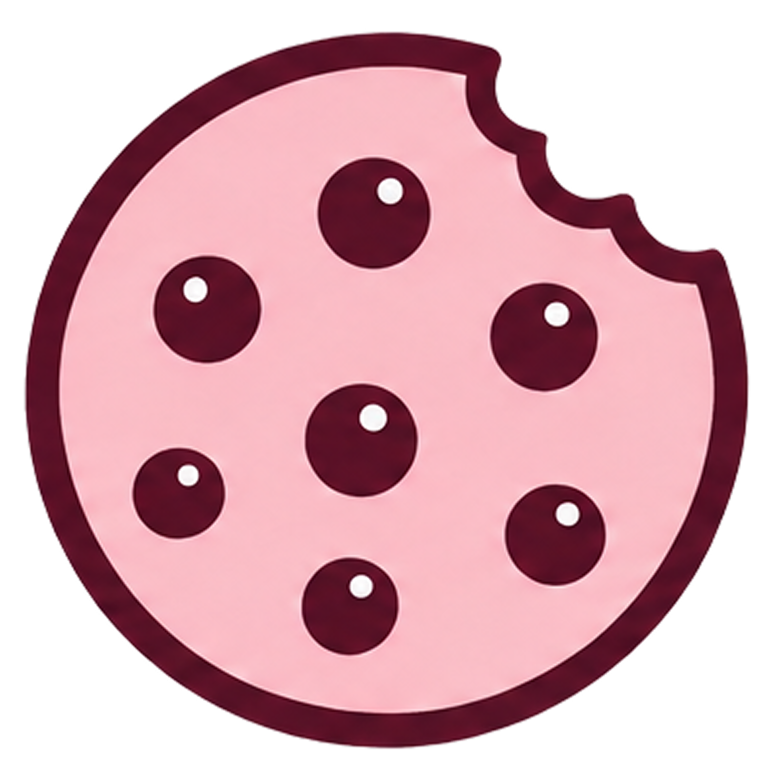
The Bitten Cookie
The playful bite completes the bakery story while making the icon more recognizable.
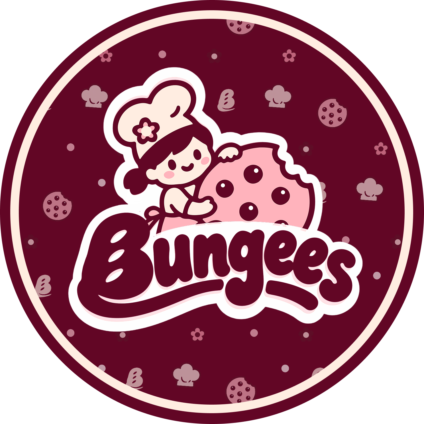
The Final Logo
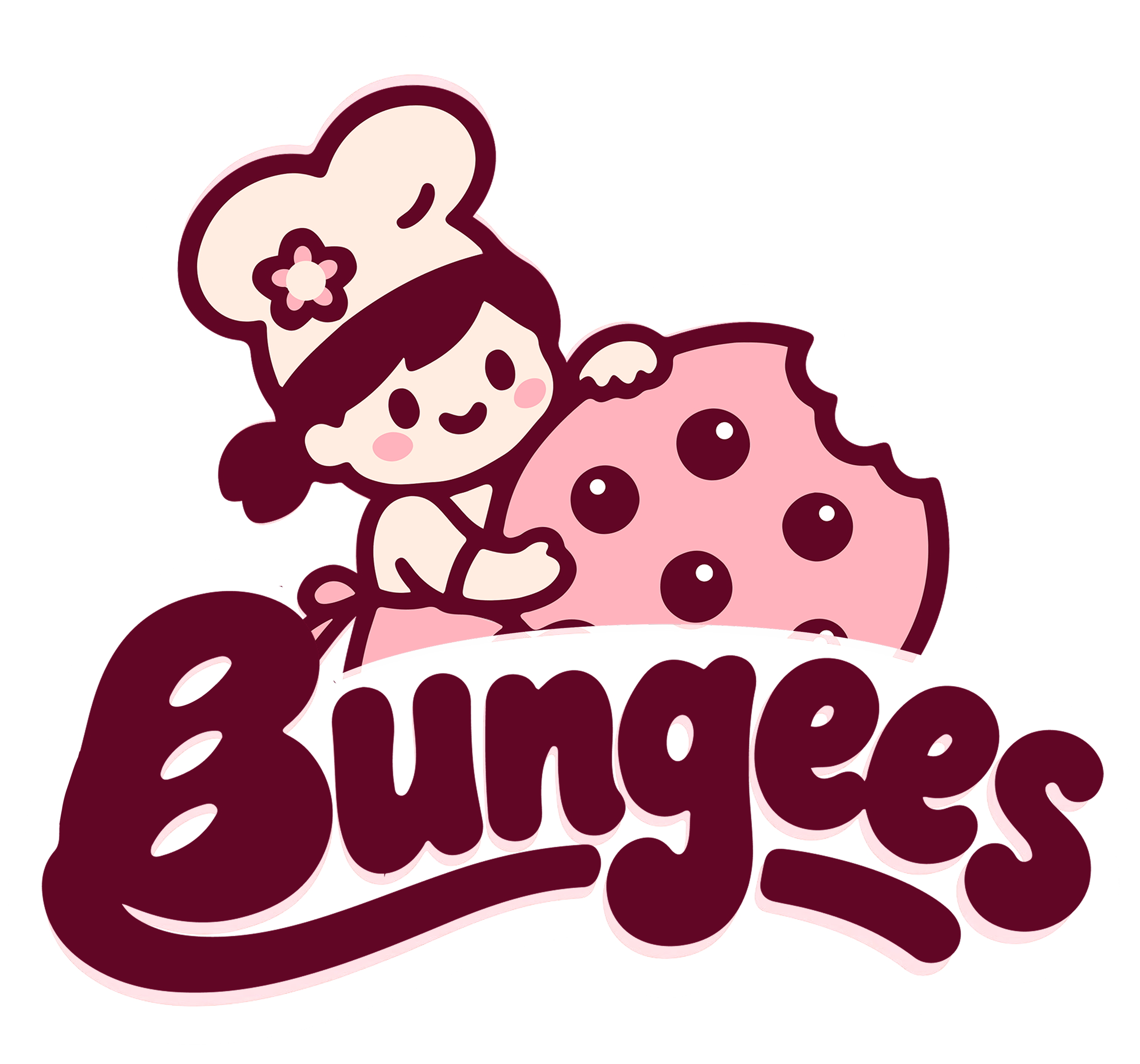
Designed to live beyond the logo
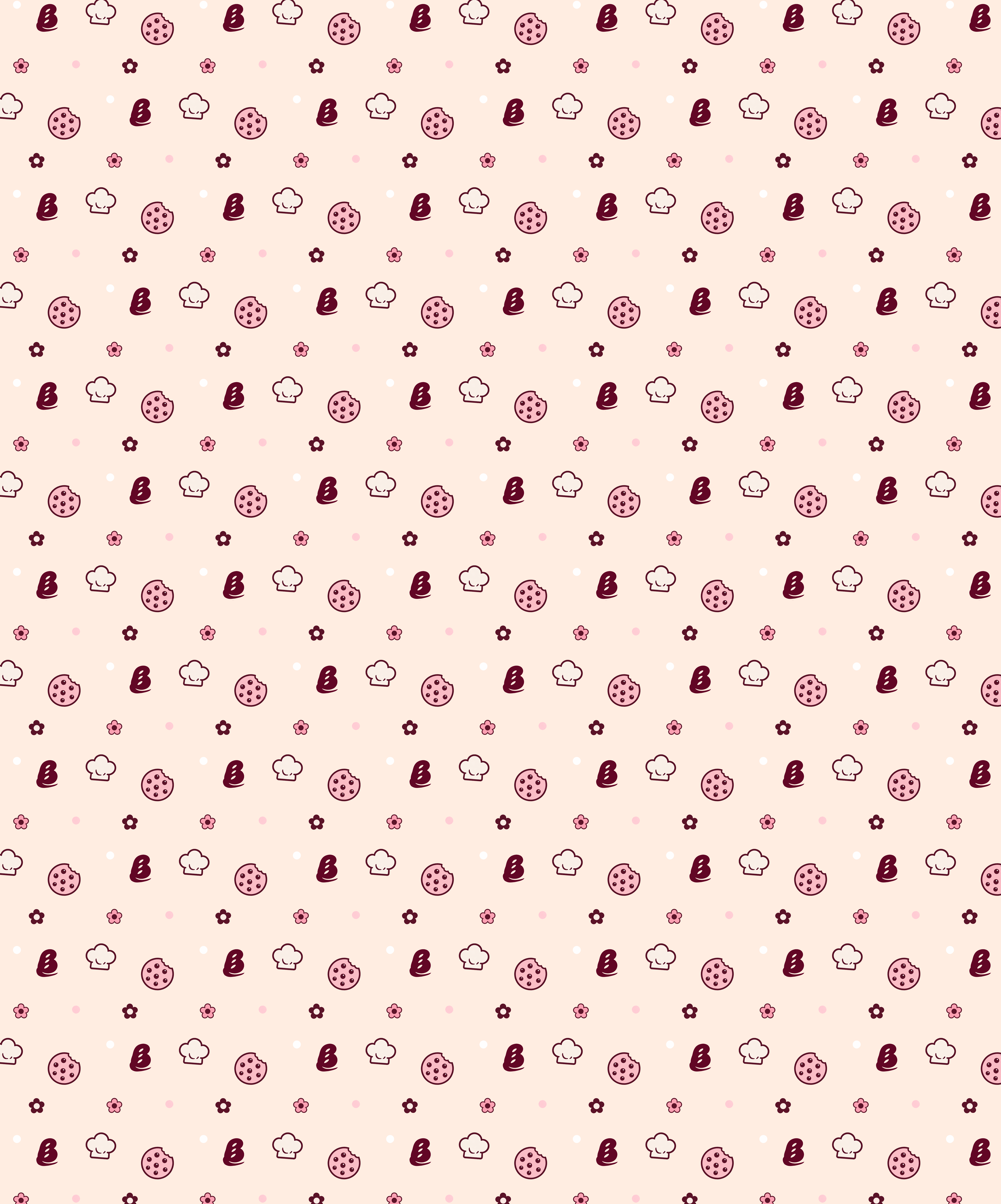
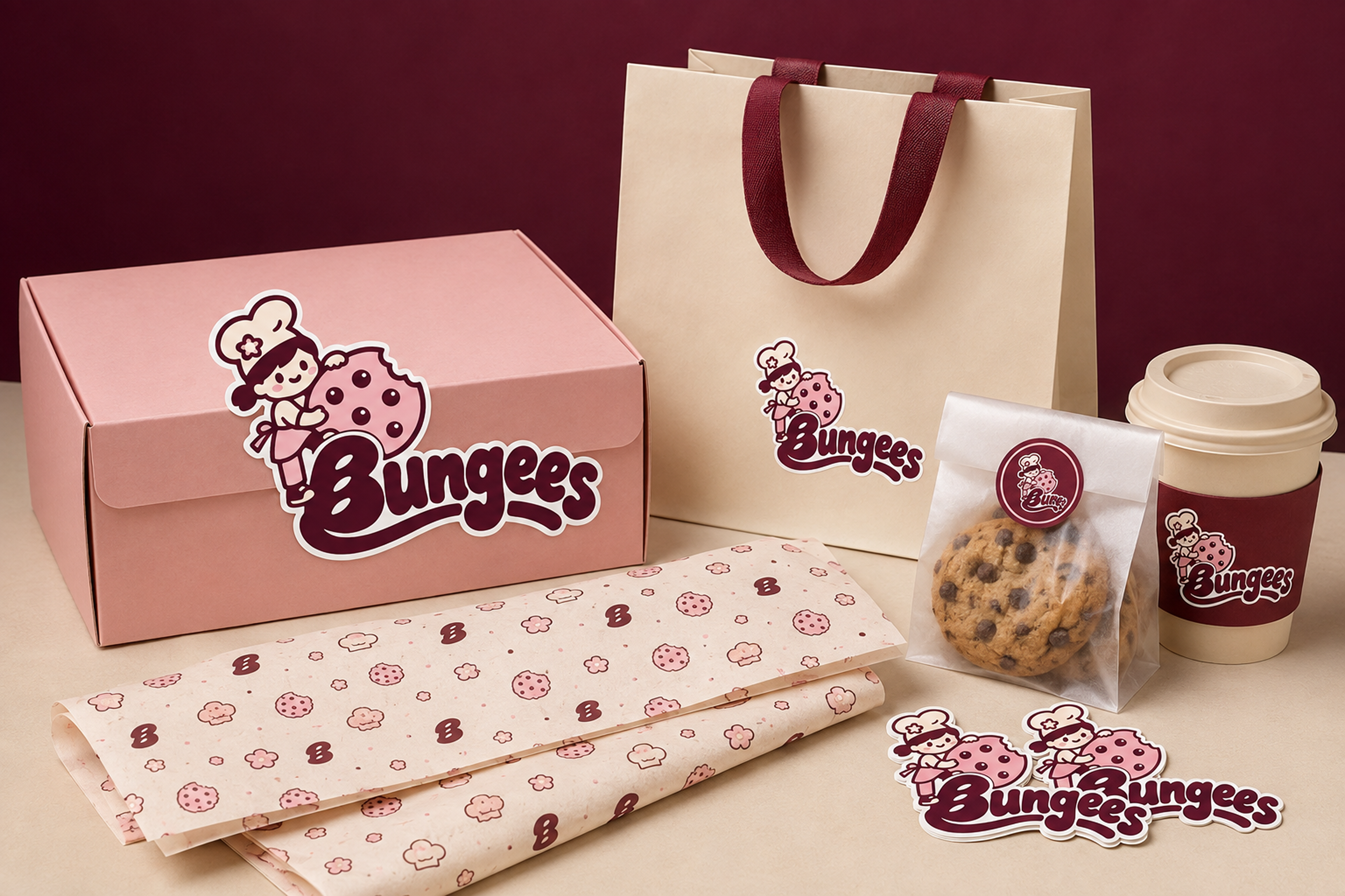
I extended the identity across packaging, stickers and wrapping paper to create a cohesive brand experience at every customer touchpoint.
The tools behind the brand


Support Bungees Bakery